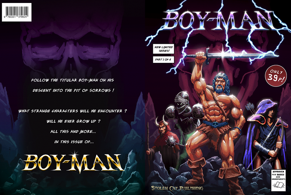
Boy-Man
A group game project I was the lead artist on. The brief provided by Lucid Games .ltd asked for a fantasy aesthetic with a cartoon or comic art direction, featuring a card building mechanic and RPG elements.
As a team we opted for a 2.5D side scroller with 2D Animated sprites and 3D backgrounds. This would allow us to accommodate team members who specialised in 3D.


Trailer
watch a short gameplay teaser for the game.
Itch.io
Visit the game's itch.io page for more information on the game.
Click on the button below!


Art Direction
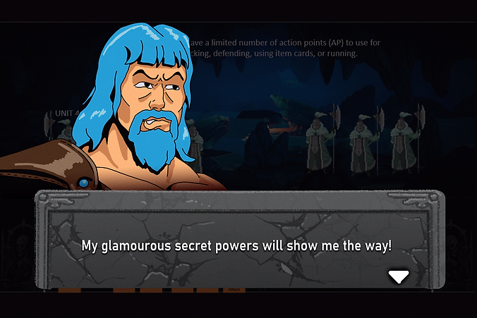
The main inspiration for the 80's Saturday morning cartoon art style was from researching the production methods from shows like He-Man and G. I. Joe.
After showing initial concept's to the team we all agreed that we had something with potential.
We wanted to parody the 80's cartoon hyper masculine heroes and create a game that would mimic the approach Cuphead used with 1930's Animation, but on a much smaller scale.
Character
Design
The 80's cartoon style allowed for some looseness with the animations, our limited time and animators forced us to animated on a low frame rate to save time.
I referenced original character turnarounds from He-Man productions to capture the same energy, with a little more Conan influence sprinkled in.


The two protagonists I designed heavily referenced the artistic trends of American cartoons from the 70's to 80's.
Female character designs from this time were hyper feminine.
I tried to adapt the designs to be more appropriate but retain the aesthetic.


Rouges
The Skeleton faction pulled heavy influence from the 80's Skeletor design, using a similar simplified skull design and colour palette. The skelly boss was heavily influenced by the Mars Attacks aliens and 80's fantasy villains.
UI - Concepts
Early on I made a push to bring in elements of old UI design from the likes of Golden Axe and the original Fallout. With large areas dedicated to buttons and a viewport for showcasing the combat and animations.
I looked to board games like Hero Quest when concepting the aesthetic of the UI tiles. I approached the UI as if it was a diegetic stone tablet.

I tried to give each UI element a decorative appearance, with ornate carvings, and worn down stone.
the brief required a minimum of 4 main party characters, so adopting this UI format would create a wider window to showcase the characters and allow the lower section of the screen to highlight the various spell cards.

As we began to better establish the features of the game, we made changes to better optimise the UI, removing features like the map and spent cards.
As the game evolved we adopted a cleaner and more simplified UI that abandoned the decorative aspects.
Card Borders - Concept Design
We needed to create a combat system that centres around deck building and cards. We needed a modular border design that could be easily changed to indicate its function to the player.
We looked to existing card games, like Magic: the Gathering and Yu-Gi-Oh for reference when designing the look of the cards.


.png)
Initial Border Concept.
Too free-form and complex. odd frame for background art.
Second Concept
Dungeon tile appearance.
Needs more space for Card stats, name and info.
Yu-Gi-Oh esq.
Concept Development
Dedicated areas for Mana cost, Title and effects. Improved texture work and border design.
Final Design
Stone colour indicates character used. Metallic corners indicate Rarity.

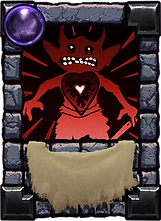
Card Artworks
We needed a minimum of 60 unique cards for the Alpha build. To make the cards visually distinct we opted for each to have its own illustration, with the rarity of the card dictating how detailed the artwork would be.
I wanted the cards to stand on their own and provide a little more detail of the simple cell shaded character sprites. I looked to 80's vinyl artworks for inspiration when making these.


Menu Comic Concept
Inspired by Brutal Legend's stylised menu navigation and use of real footage of a vinyl record, we wanted to do something similar but with a Comic book.
With Speech bubbles being used in place of menu buttons and page turns to sub menus.
Though I illustrated comic panels with repurposed artwork, we did not have enough options in the game to fully realise this feature, so it was cut.